An accessibility-first redesign of the Harvard Pilgrim Health Care portal and public site.
ClientHarvard Pilgrim Health Care
•
Year2018
•
RoleAccessibility • WCAG 2.1 AA • Information architecture • Responsive design • Design systems
Overview
The Harvard Pilgrim Health Care portal was a patchwork of aging microsites that members described as a hall of mirrors. For anyone relying on assistive technology, basic navigation was practically impossible.
We undertook a complete redesign of the public site and authenticated member portal, embedding accessibility into the information architecture from day one.
My role
As UX design lead and accessibility specialist, I guided research activities, ran client workshops, liaised with independent accessibility auditors, and partnered with UI and front-end engineers to resolve complex interaction patterns.
Results
WCAG AA+
Accessibility compliance
First US health plan portal to meet WCAG 2.1 AA alongside key AAA criteria.
< 2s
Page load speed
Reduced from roughly 10 seconds under a strict 300kb performance budget.
85%
Legacy content removed
Redundant microsites retired and core journeys rewritten in plain English.
Homepage comparison: before and after
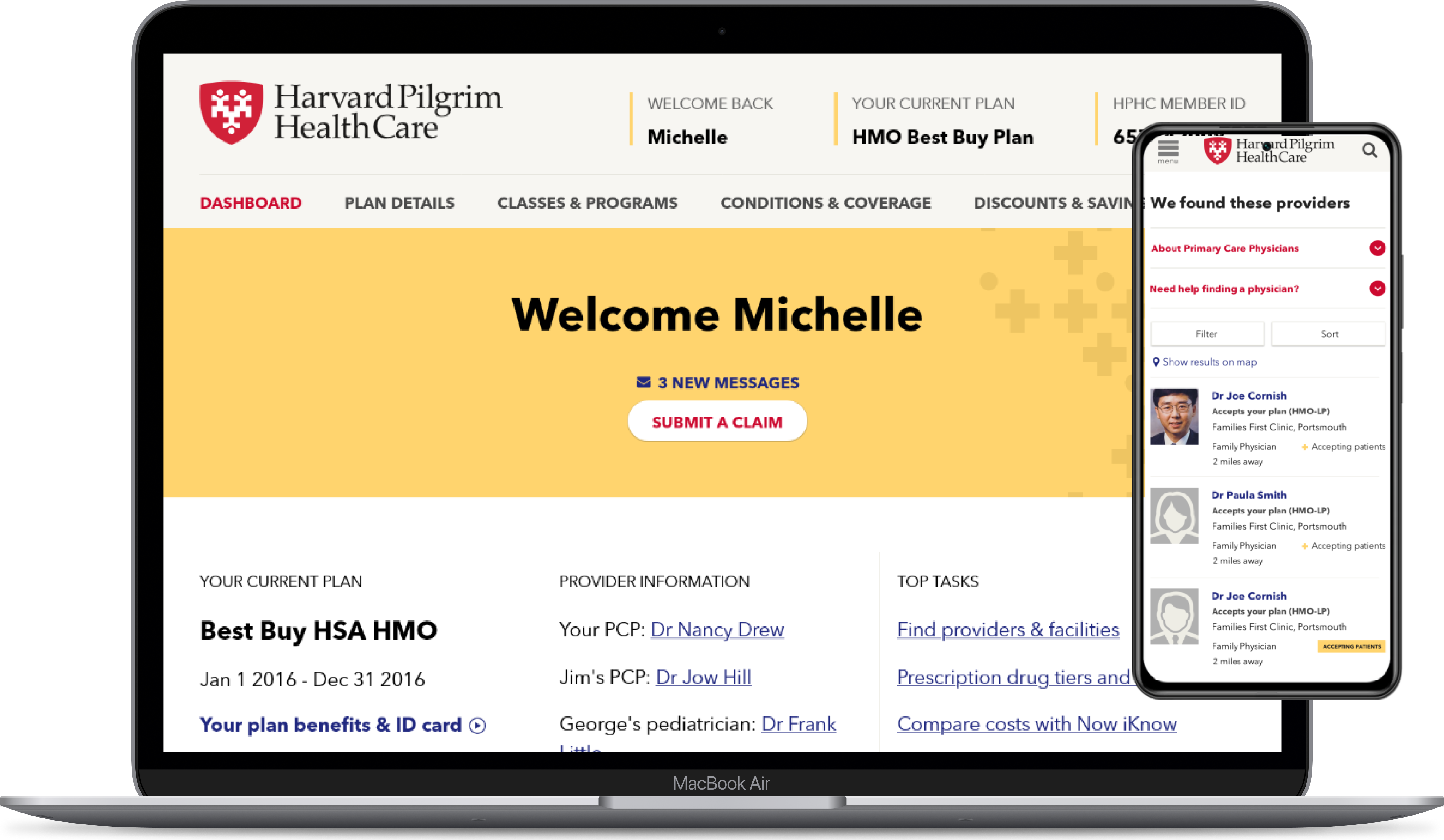
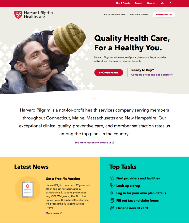
The legacy portal was locked to a fixed 900px desktop layout and split across disparate subdomains. We consolidated the experience into a single responsive structure, prioritising daily tasks such as finding an in-network doctor and checking benefit balances.
After
Before
⇄
Comparison showing the legacy fixed desktop page versus the accessible, responsive homepage.
Discovery
Understanding member needs
Our research combined quantitative analytics and server logs with call-centre observations and in-depth interviews with prospective and enrolled members.
I co-led member interviews and research synthesis. To quantify comprehension gaps, we ran an insurance terminology quiz with participants, testing how accurately people understood common policy concepts.
Research findings showing widespread confusion over fundamental insurance terminology.Research findings
Primary user problems
Fixed desktop layouts
The legacy portal relied on a fixed 900px container with no mobile viewport support, creating steep hurdles for members managing their care on phones.
Fragmented
Independent microsites and third-party tools were stitched together under a shared header, leading to abrupt visual shifts and navigation dead ends.
Duplicate content
Without central editorial governance, conflicting policy explanations accumulated across the site, leaving members unsure which version was accurate.
Non-inclusive insurance jargon
Copy was written from an internal claims perspective. Most participants stumbled over the difference between copay and coinsurance, often assuming “covered” meant fully paid by insurance.
Accessibility evaluation
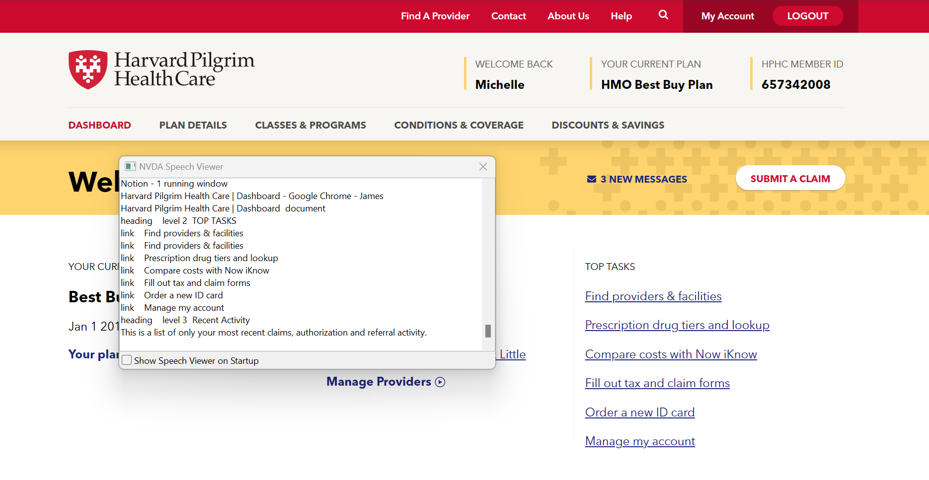
I ran automated WCAG scans to catalog baseline defects, followed by manual keyboard audits and walkthroughs using VoiceOver and NVDA screen readers across all main subsites.
The audit exposed severe structural traps: missing landmarks, broken tab indexes, and unlabelled form controls that made the site unusable for members relying on assistive software.
Strategy
During the strategy phase, we established our information architecture, digital governance principles, and technical accessibility benchmarks.
Task modelling
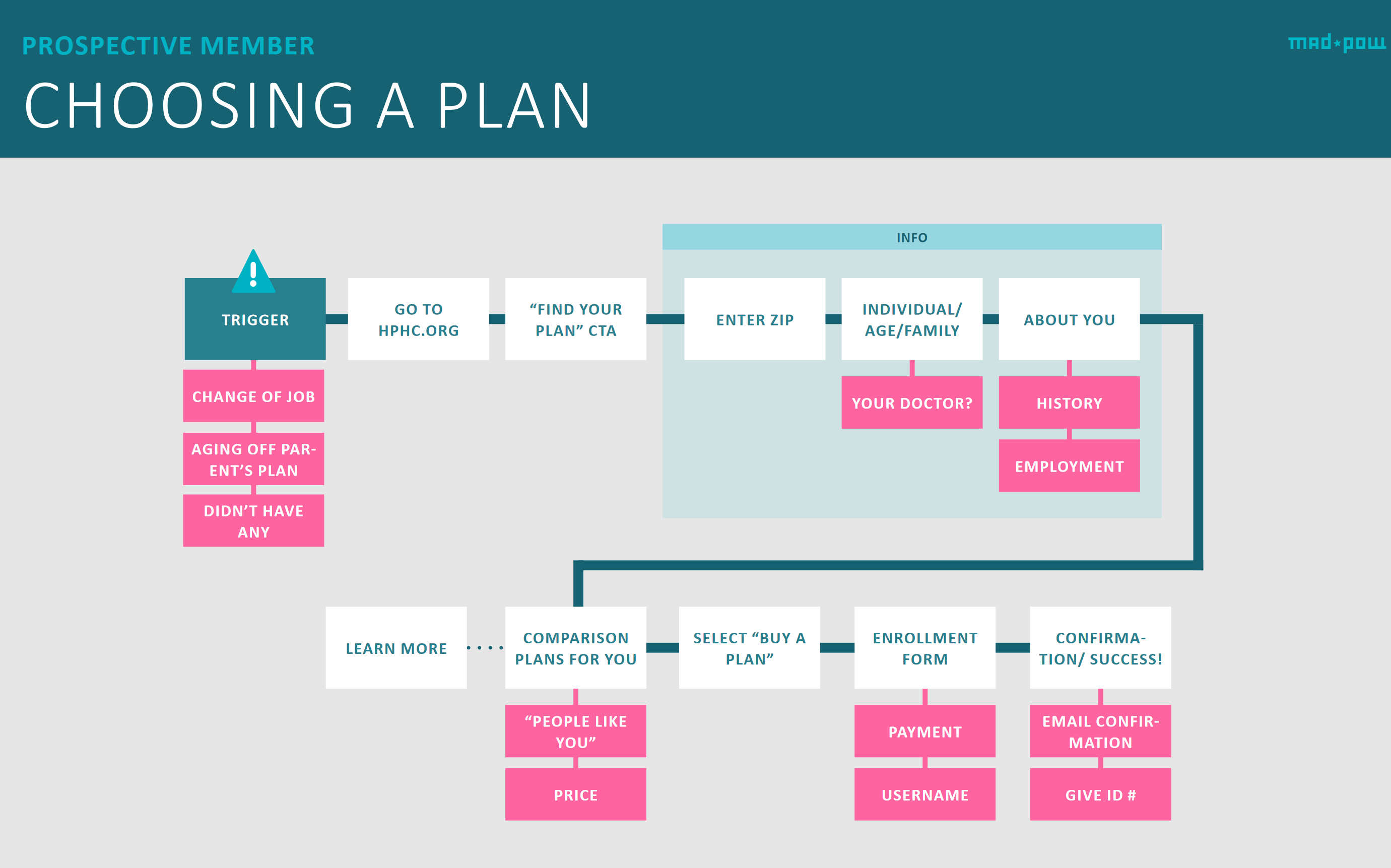
We mapped core user journeys to clarify how members research and compare health plans, untangling complex decision trees before drafting page templates.
Cohort empathy mapping
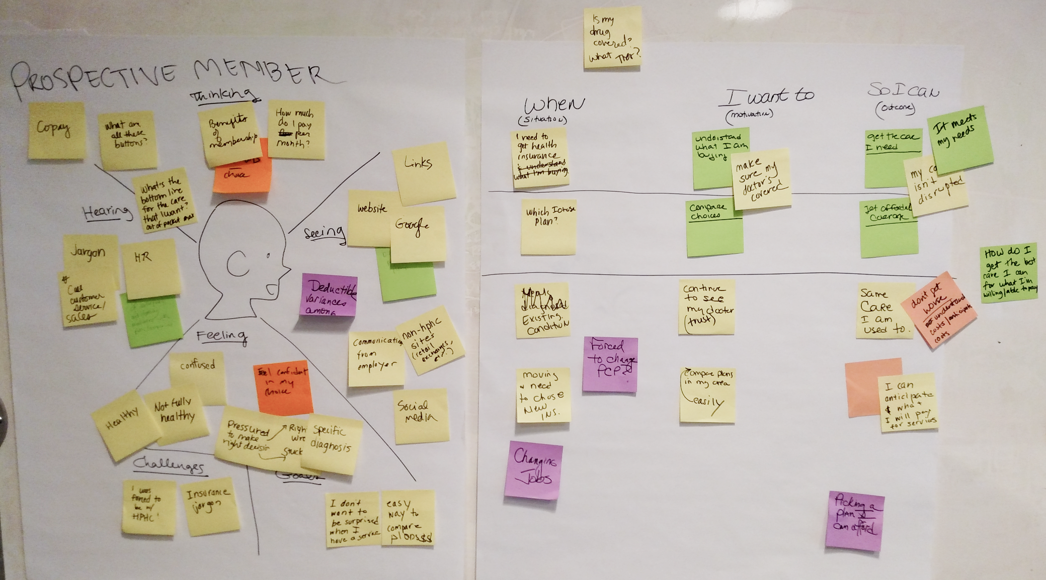
We ran empathy mapping workshops with clinical and service teams to capture specific functional needs across diverse patient groups, including chronic illness management and elder care.
Concurrent design and engineering
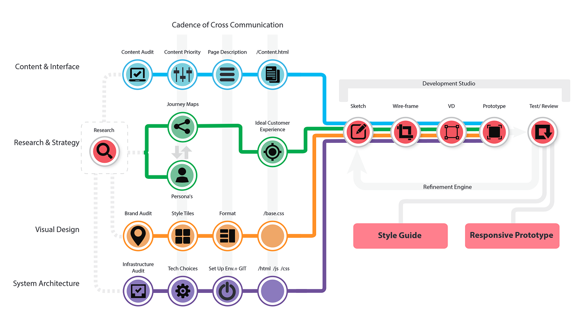
Rather than running a traditional waterfall handoff, UX architecture, content strategy, visual design, and front-end engineering worked in parallel sprints.
Accessibility-first design goals
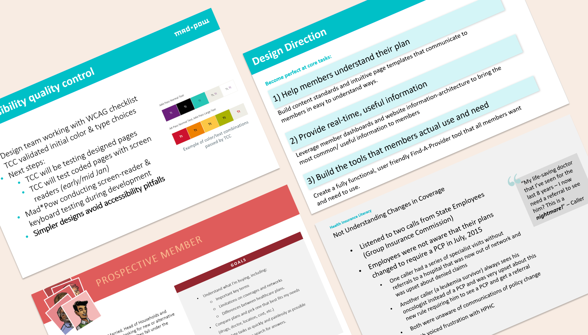
Reaching a high accessibility standard required more than superficial code remediation: we needed a lasting governance and design model.
Additional Note
Usability testing with assistive technology specialists revealed recurring blockers in the legacy checkout flow, reinforcing the mandate for executive sign-off.
Standards compliant
Targeted WCAG 2.1 AA compliance while adopting achievable AAA criteria wherever practical.
Tested with disabled users
Tested prototypes directly with visually impaired participants to validate everyday navigation rather than superficial checklist adherence.
Internal capability building
Trained internal design and engineering teams to audit their own interfaces using keyboard controls and screen readers.
Authoring guidelines
Delivered documentation for content authors covering accessible PDF generation, video transcripts, and semantic heading structure.
Procurement governance
Created an accessibility compliance framework for vetting future third-party software vendors and digital partnerships.
Accessible design tokens
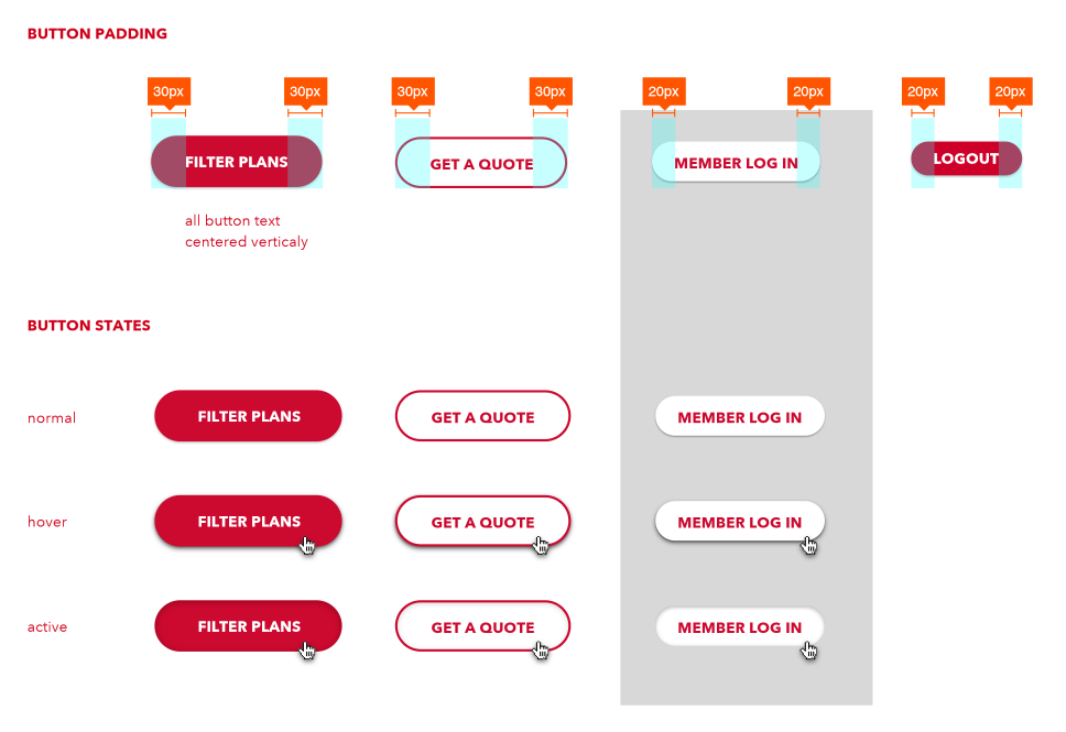
Established design system tokens that enforced high contrast, legible typography, and explicit focus states across all interactive states.
Design development
Content simplification
We audited thousands of legacy pages, cutting redundant articles by 85% and rewriting essential clinical and policy guides into concise, everyday English.
Design studio workshop
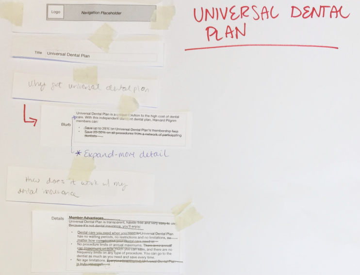
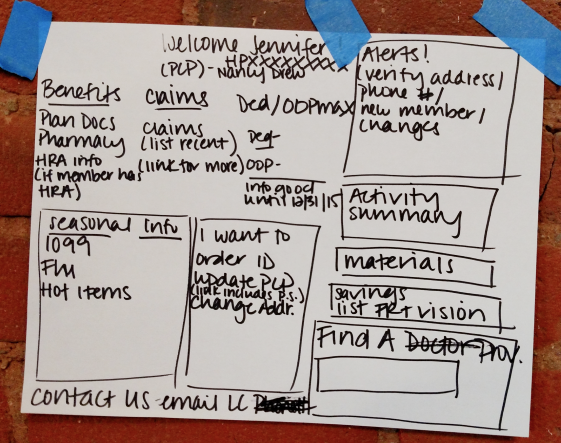
We ran collaborative sketching workshops with client stakeholders, using rapid paper prototyping to test layout hierarchies and navigation groupings before digital production.
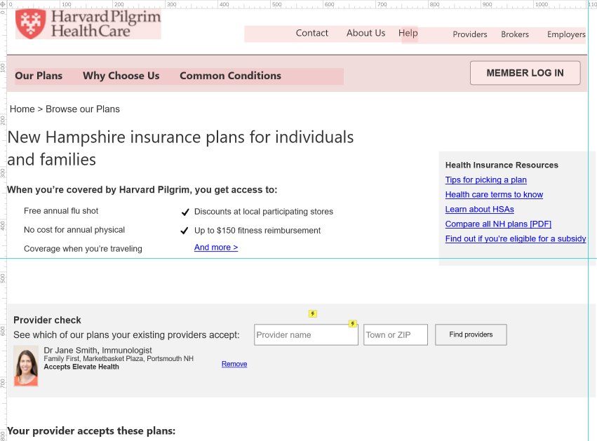
Interactive wireframes & Axure prototyping
Co-locating UX, visual design, and front-end developers accelerated progression from sketches to working code. I built Axure prototypes to stress-test complex filtering logic for the Find a Doctor tool before engineering began.
Brand exploration
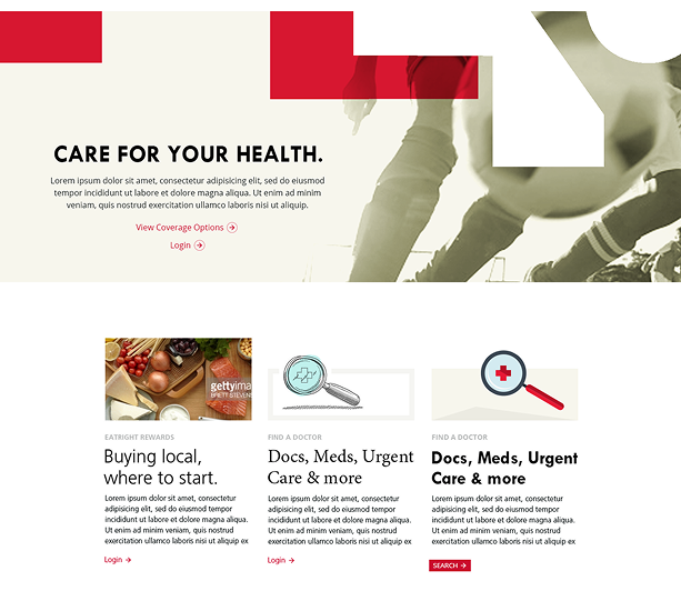
The visual palette departed from generic corporate blues, incorporating Harvard Pilgrim’s distinctive warm red and yellow tones while calibrating shades to meet strict WCAG contrast standards.
Modular design system
Partnering with the UI lead in Sketch, we defined accessible components with prominent focus indicators and clear hover states. To protect mobile page speed, we applied a 300kb budget, prioritising SVG graphics and system type over heavy imagery.
Testing & validation
We conducted three rounds of usability testing across design and development, evaluating task performance with 12 to 18 participants per round, including users navigating with screen readers and screen magnifiers.
NVDA text output inspector used for rapid screen-reader traversal checks.
Retrospective & outcomes
Outcomes
Delivered on schedule
The project launched on time and within budget, establishing a modern digital baseline across public and authenticated portals.
WCAG 2.1 AA compliance
Achieved full WCAG 2.1 AA compliance across core journeys, including several AAA criteria, providing a structured foundation to retire remaining legacy tools.
Independent endorsement
The Carroll Center for the Blind audited and endorsed the platform, praising the intuitive structure and effortless screen-reader navigation.
85% content reduction
Retired hundreds of outdated microsites and rewrote core member journeys in clear, everyday English.
Sub-2-second page loads
The final production templates came in well under the 300kb ceiling, cutting page load times from 10 seconds to less than two seconds.
Reduced support overhead
Enabling members to manage key tasks independently online deflected routine calls and reduced operational expenses.
Takeaways
Demonstrations build empathy
A five-minute live demonstration of a screen reader struggling on a broken page secured more stakeholder support than an audit report with hundreds of defect rows.
Test terminology early
Testing showed that even experienced members struggled with basic insurance terms. Plain language is as vital to accessibility as colour contrast or semantic code.
Embed engineering from day one
The most dependable accessibility outcomes happen when information architecture, visual design, and front-end engineering collaborate throughout every sprint.
 After
After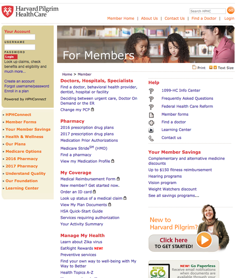 Before