Overview
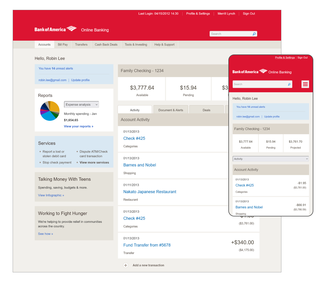
The bank’s design leadership recognized that a complete reset was necessary. They engaged my team at Mad*Pow to help modernise their approach to web design and develop a unified responsive model.
The bank’s design leadership recognised that a complete reset was necessary. They brought in my team at Mad*Pow to modernise their approach to web design and develop a unified responsive model.
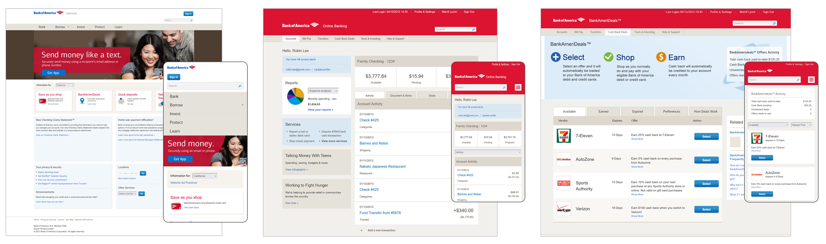
We took a cross-functional team of the bank’s designers offsite to define and build a responsive proof of concept, intended to secure executive backing for the new approach.
My role
Project lead, workshop facilitator, and interaction designer. I led a cross-functional delivery team of two developers, three designers, and a content strategist.
Homepage transformation: before and after
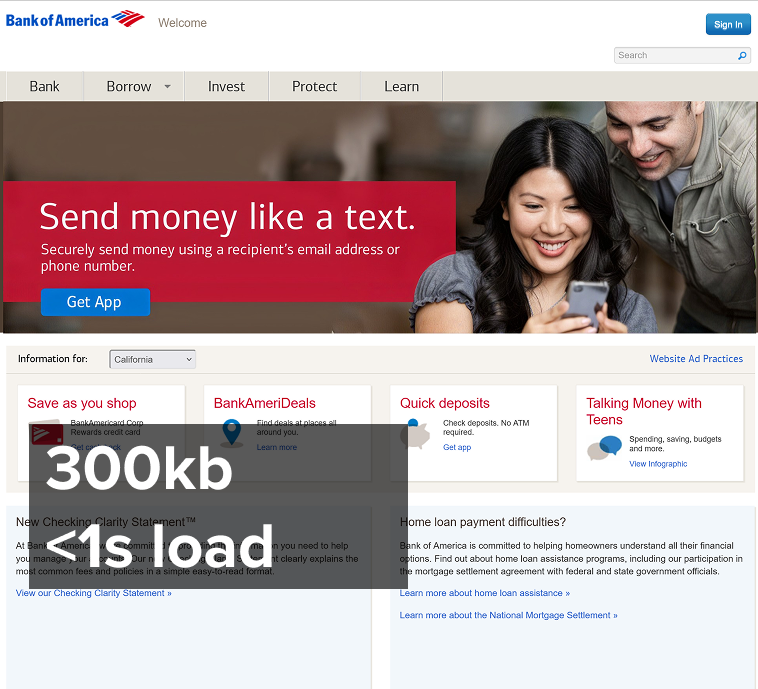
The legacy desktop homepage was dense, cluttered, and disconnected from the mobile web experience. We rebuilt the layout as a single responsive system, prioritising secure sign-in, account balances, and direct navigation.
 After
After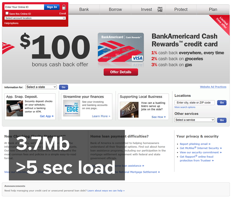 Before
“Three days wasn't enough! We’d love to have stayed for a week.”
Workshop & methodology
I ran a three-day responsive design workshop, bringing together stakeholders from design, content strategy, and engineering.
We used physical paper prototypes and cut-up content audits to work through layout hierarchy, reading order, and responsive breakpoints before opening design software.
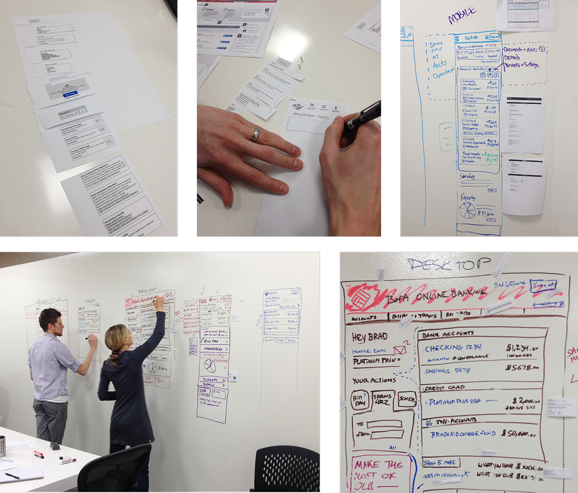
To move the team away from rigid desktop grids, we printed existing page layouts and cut the content into modular sections. This gave us a practical way to test how multi-column desktop layouts reflow on smaller mobile screens.
Architecture & journey mapping
We mapped user journeys across common everyday banking tasks to identify shared structures and consistent interaction patterns.
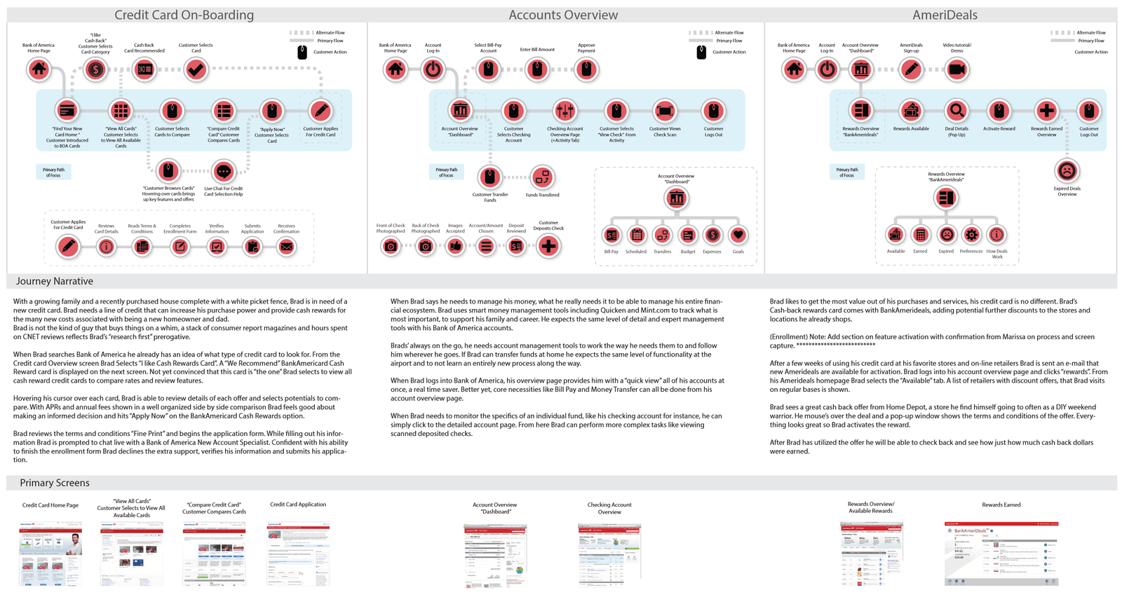
Moving from journeys to layouts, the team sketched interface ideas on whiteboards, exploring how tabular statements, transaction feeds, and navigation menus adapted across different screen sizes.
Prototyping & delivery
Static design files were not enough to demonstrate fluid grids, keyboard accessibility, and responsive performance to leadership.
I led the development of a coded, WCAG-compliant responsive prototype covering three primary journeys: the homepage, the credit card application flow, and the customer account dashboard.